 NESW has been awarded an Idea Grant from the National Association of Science Writers to organize a one-day workshop called “Telling Science Stories with Code and Data. The idea is to create new and better SCIENCE stories by exploring and leveraging the new tools available to journalists—computer programming and data analysis.”
We hope to schedule the workshop in Spring 2015. Help us tailor it to you and your needs. We have in mind a hands-on workshop that is story-driven, not tools-driven (in contrast to “data journalism” workshops, which are typically tutorials in a particular tool). We need your input to design a workshop that equips you with skills, ideas and tools you can use for your stories and that advances the state of the art.
Below are a few examples of workshop exercises and a simple questionnaire. If you are interested in participating, please take a moment to tell us whether the examples seem useful and relevant, or to give us alternative ideas that better match your needs. We also want to know what you would want to gain from such a workshop.
The workshop will most likely be held in Cambridge, Mass. Attendance will be limited so that participants can work in small, well-supported groups to learn skills by exploring sample challenges together. The grant will allow us to keep registration fees very low and also to create a community website where we can share videos, tutorials and other resources afterward.
Here are three hypothetical examples of projects workshop groups could tackle:
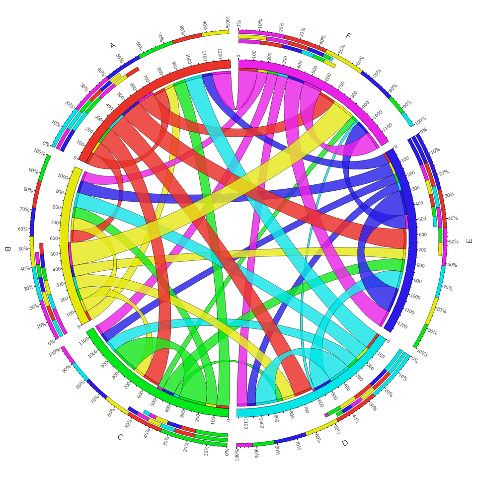
1. Look for patterns in public data. Federal research funding is shrinking. Can we say anything interesting about how Massachusetts, traditionally a grant magnet, is faring? As a way to explore the challenges of acquiring and analyzing data, let’s scrape or download a decade of funding data from NSF, DOE or NIH and plot total funding and proposal success rates to look for trends and differences between Massachusetts and the rest of the nation.
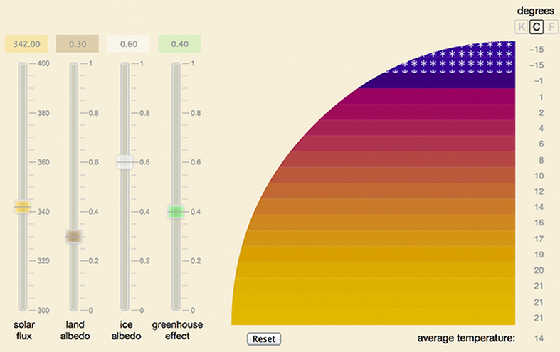
2. Create an online interactive. A new screening test claims to diagnose green left thumb disease with 90 percent accuracy. Critics point out that because the incidence of green left thumbs in the U.S. population is only 1 percent, almost 90 percent of the positive results will be false positives. How can a test that’s 90 percent accurate give 90 percent wrong answers? As a way of learning to illustrate science stories, let’s create an interactive online illustration that will help readers understand this seeming paradox.
3. Visualize data on a map. In medieval Europe the bubonic plague spread at a speed of four miles per day. In the modern world, with air travel, epidemic diseases can move a lot faster. Using open-source mapping software and a database of air routes, let’s try creating a map showing possible paths of transmission for the West African Ebola outbreak.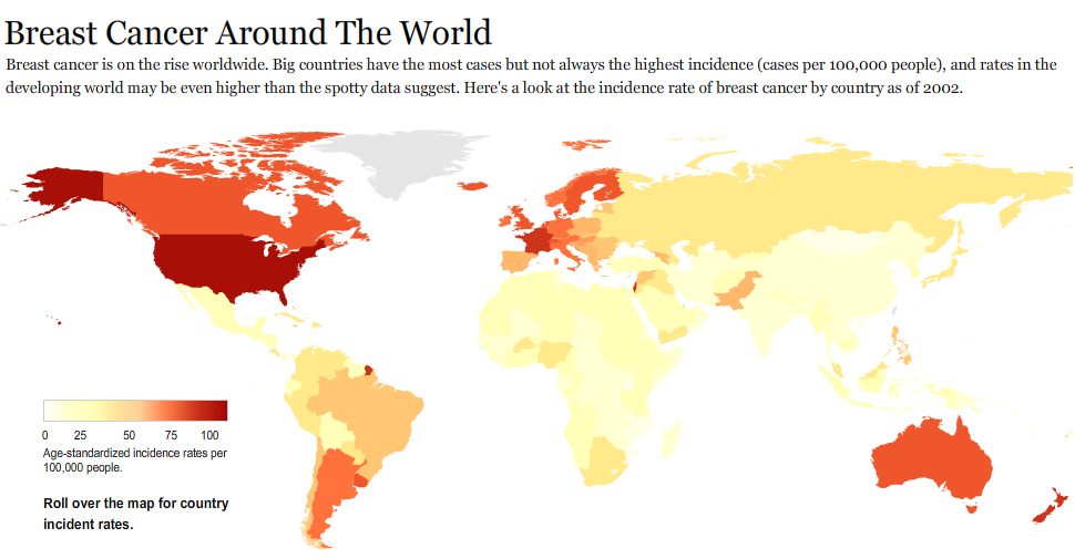
Please use this online form to let us know what you’re interested in, give us your suggestions and get on the mailing list for workshop details:
https://docs.google.com/forms/d/1c1PDRz8DbNc96jKHJFcnvDulH0lcx-6ga3QoRNbznys/viewform?usp=send_form
